Color
Color is core to our brand. It gives us confidence and elegance while leaning into our beauty works better brand principle.

Brand color palette
Spot Colors
Our primary colors are black and white.
Black is elegant, confident, and professional.White represents simplicity, peace, and creativity.
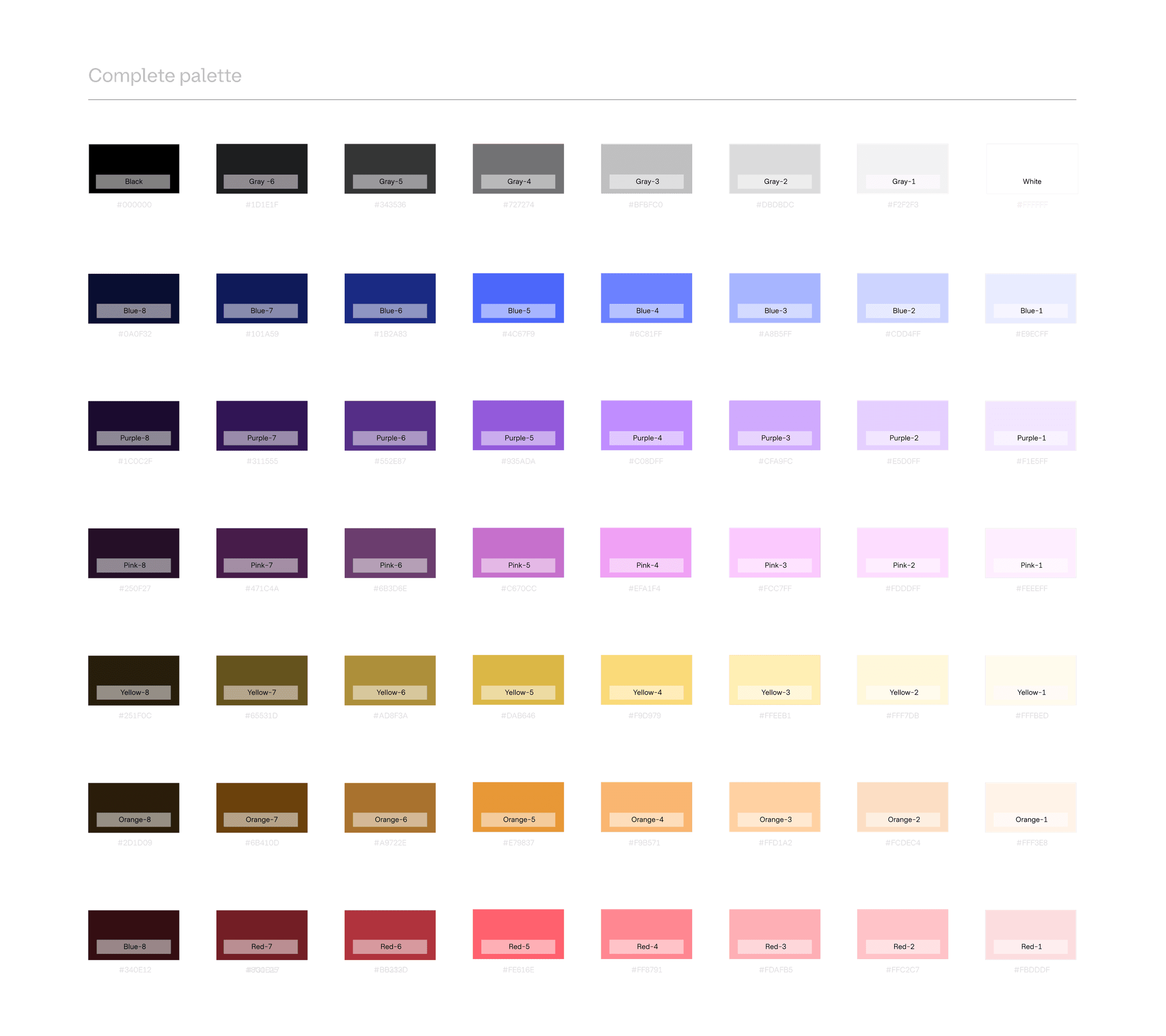
The full breadth of our color palette includes a range of warm to cool hues that are referential to our product colors, but contained to a more refined, simplified, and branded gamut. These colors are to be used for brand-agnostic themed content (And are the building blocks of our several branded gradients).
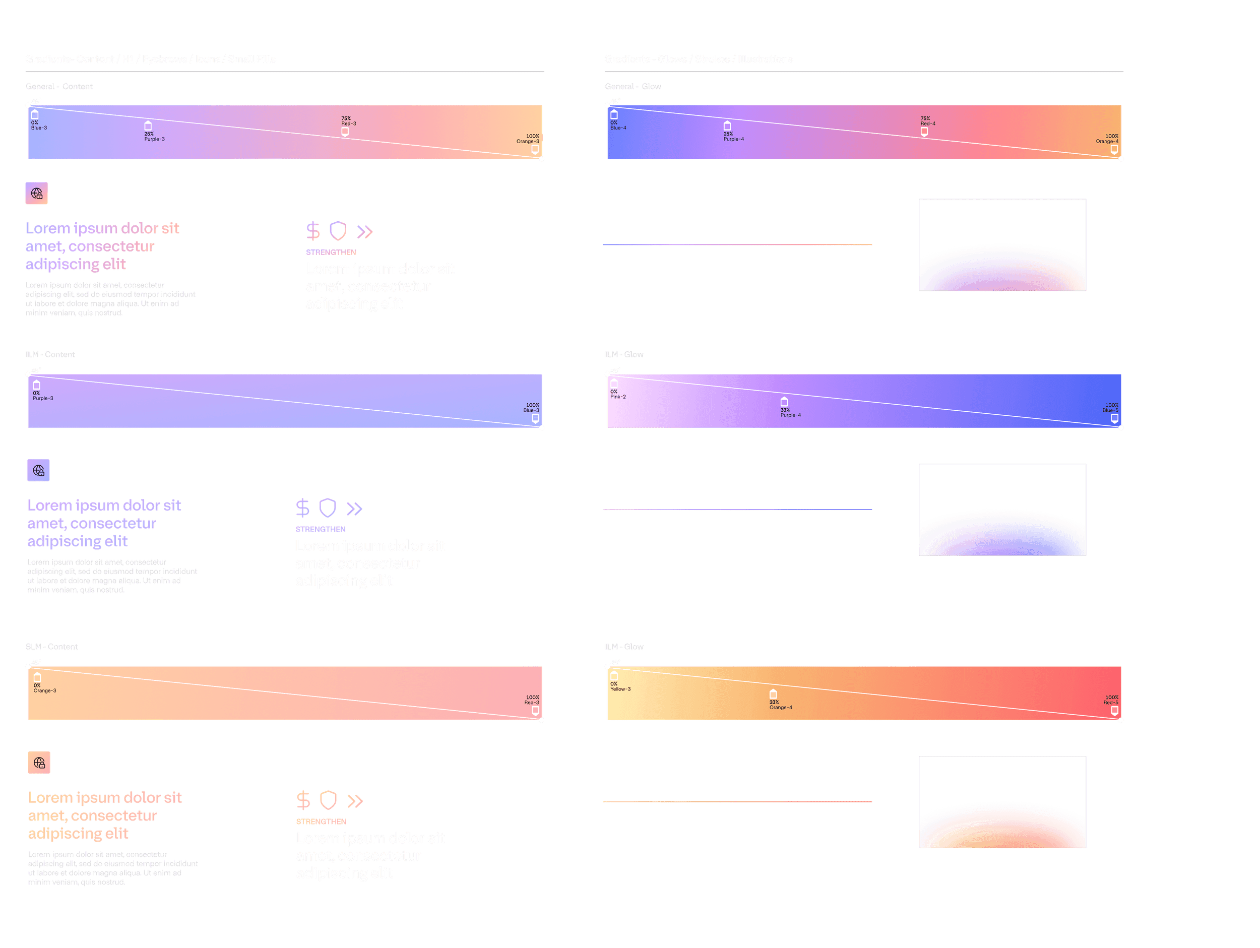
»Brand Gradients
Our iconic product colors are reserved for product-specific language, however, we have created a simplistic, universal color gradient to be used in all branded scenarios. The gradients are derived from these product colors and give a visual cue to our infrastructure and security lifecycle management portfolios.
For Headline text, strokes, or icons, we use any of the following 3 gradient themes: Infrastructure cloud, Infrastructure Lifecycle Management, and Security Lifecycle Management.
For glows, shapes, and illustrations, we use the deeper and richer spectrum of the same color gradient for more variety and flexibility.
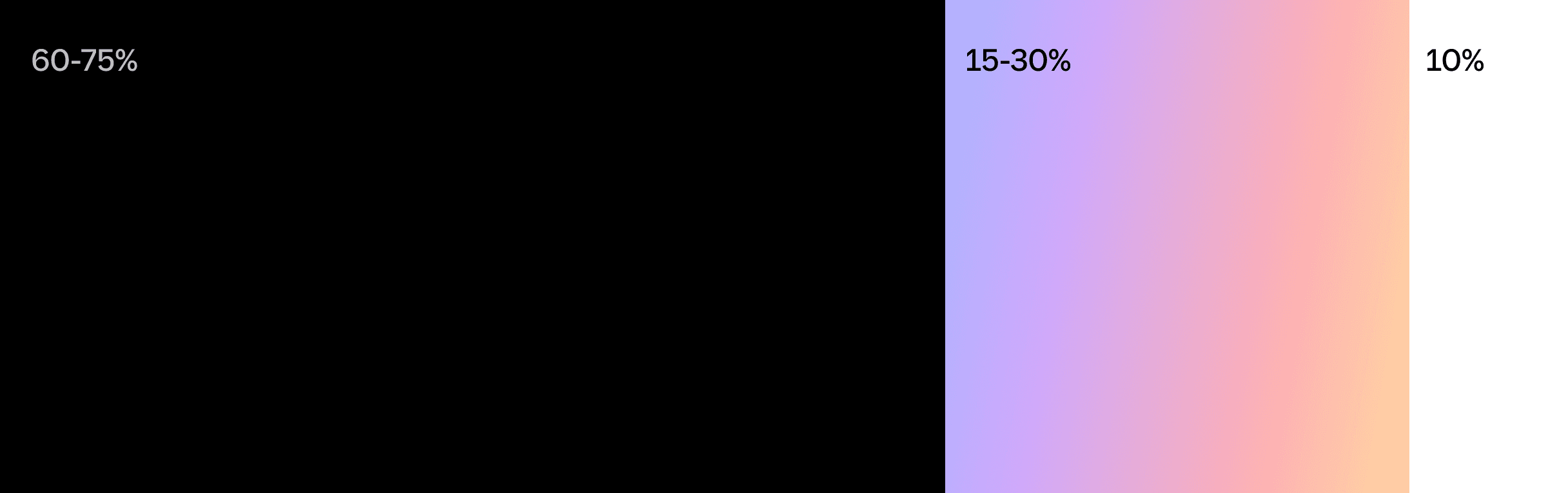
»Color usage proportions
To optimize for consistency and accessibility, we must use the below proportions.
White is generally used as the foundation of any layout.
Black is typically used for intentional contrast.
Product colors or gradients are used to highlight brand patterns, featured content, and actions.
Gray Scale

Product color palettes

»For Terraform, we utilize its iconic purple as the primary color. However, on darker backgrounds we utilize the brighter alternate Terraform purple to add more contrast.
