
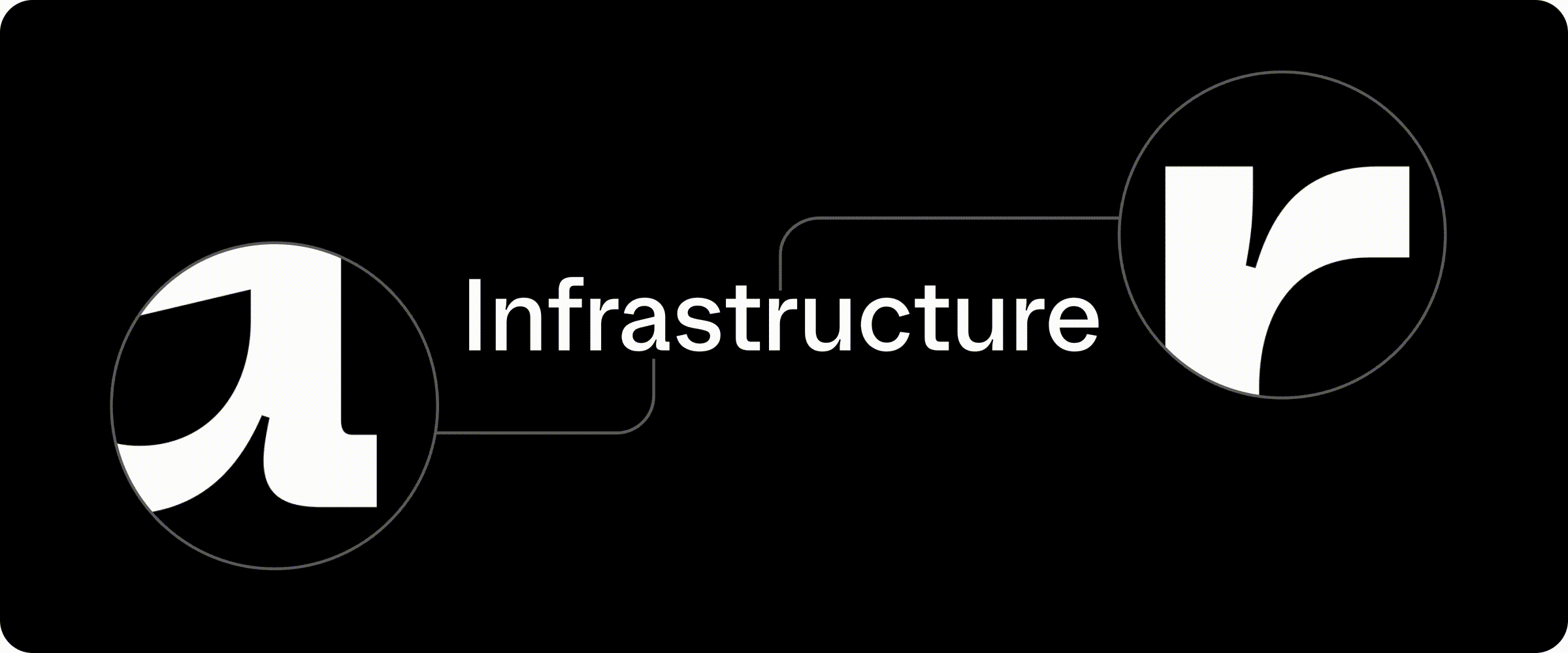
HashiCorp’s former logo and our new one using HashiCorp Sans
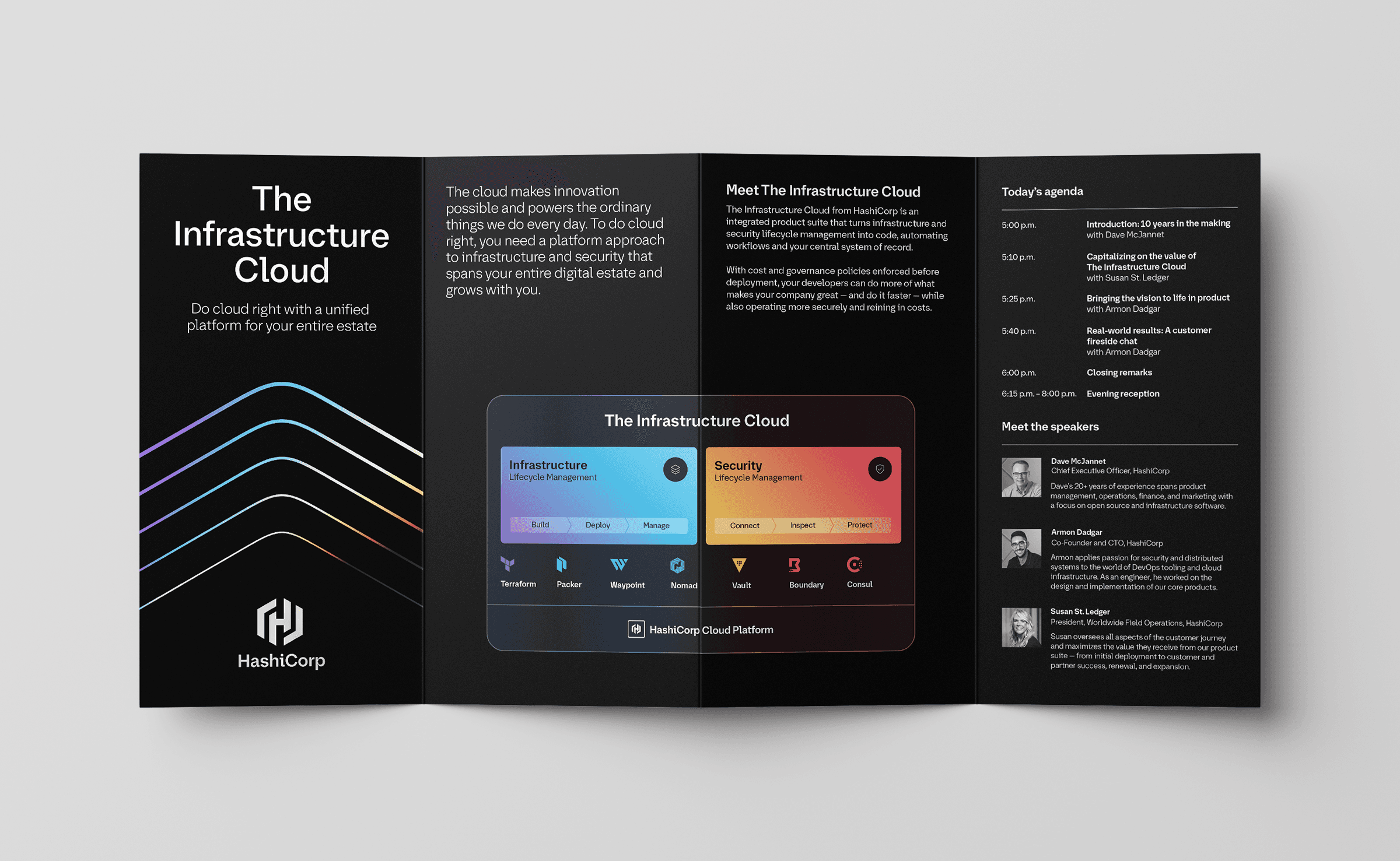
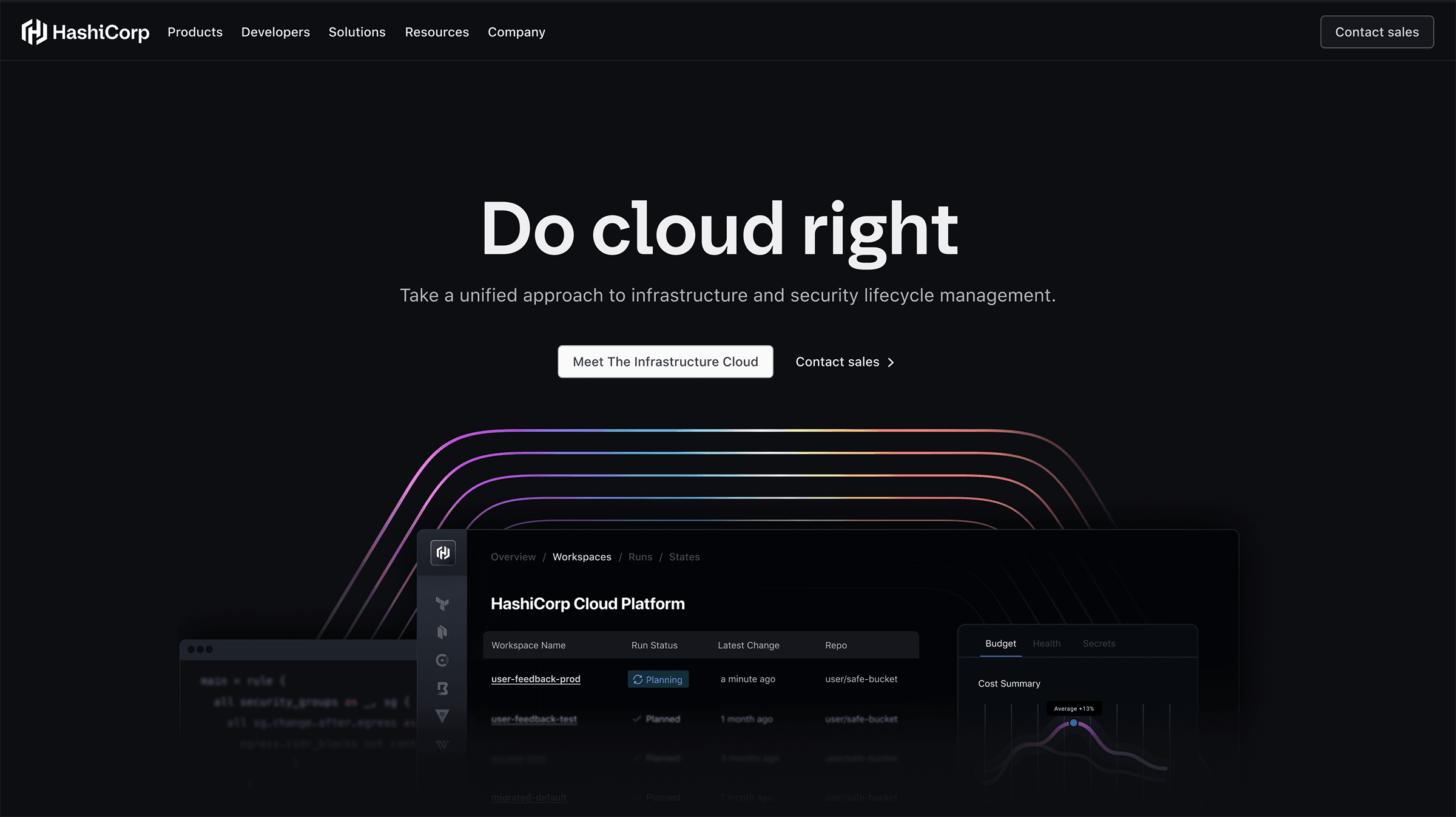
In April, HashiCorp introduced The Infrastructure Cloud at Nasdaq headquarters in New York. At this event, in front of some of our most important customers, we also launched the next chapter of our brand evolution, thanks to our Brand Studio. The new web pages, videos, ads, experiences, and presentations not only showcased our radically simplified message but also a new typeface: HashiCorp Sans — a custom font designed to reflect our brand.
»Why change fonts?
Typefaces, like logos, help establish brand context. Fonts infuse communications with a specific tone, serve as a messenger for the brand's personality, and build brand equity over time. So why change HashiCorp’s font now after 10 years?
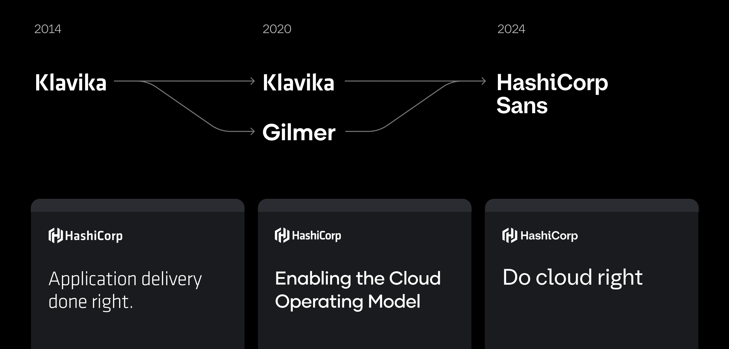
HashiCorp fonts over the years
HashiCorp’s first brand iteration used Klavika, a forward-thinking typeface blending geometric and organic characteristics. Designed in 2004 and famously chosen by Facebook in 2005, Klavika conveyed a tech-forwardness that matched HashiCorp’s status as an ambitious startup. As the company matured and reached a wider group of people, we added a new headline typeface, Gilmer, in 2020. Gilmer helped imbue a friendlier, more approachable tone that matched our evolving goals for the brand.
This combination of Klavika for logos and Gilmer for headlines served us well, but supporting two typefaces added complexity to our design efforts. Visually, these typefaces — chosen six years apart for very different reasons — shared little. Last month’s introduction of The Infrastructure Cloud offered the opportunity to streamline our type system while positioning HashiCorp as a brand empowering technical and business teams and conveying trust by the world’s largest enterprises.
»How we created our own font
We wanted a beautifully built typeface that could embody our brand for decades to come. We’re not professional type designers, so we decided to work with a type foundry to help execute our vision.
In early 2023, we reached out to XYZ Type, an independent typeface design studio with a notable and diverse range of clients including Rolling Stone magazine, Dartmouth College, and the London Stock Exchange. We were drawn to XYZ Type’s inquisitive, process-driven approach. Rather than follow styles or trends, XYZ looks to the DNA of a brand and the history of its niche, then draws from its own deep knowledge of type design and history.
»Meet HashiCorp Sans
Over the next year, XYZ presented us with sketches and ideas that captivated us, challenged us, and ultimately guided us in crafting a distinct and remarkable typeface for HashiCorp.
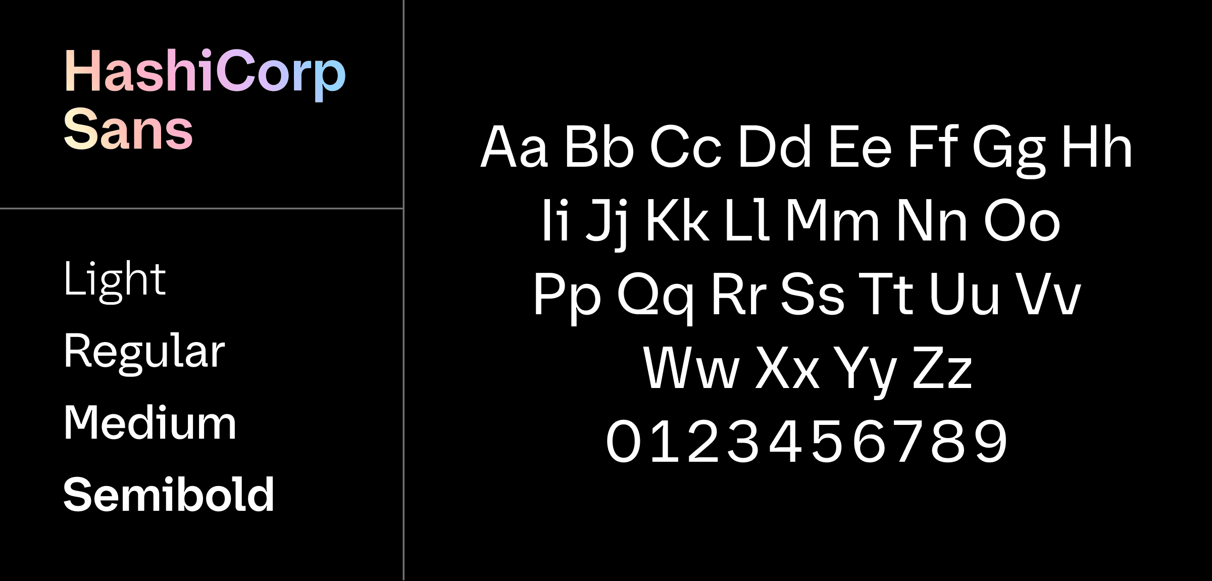
Developed as a display typeface available in Light, Regular, Medium, and Semibold, HashiCorp Sans now appears across all our corporate and product logos and headlines. Four defining characteristics make it distinctive for HashiCorp:
- Accentuated bridges to create a horizontal flow
- Developer-inspired monofont characteristics
- Adding 'sparkle' to imbue a sense of light
- Humanist references to hand-drawn letterforms
»Flow
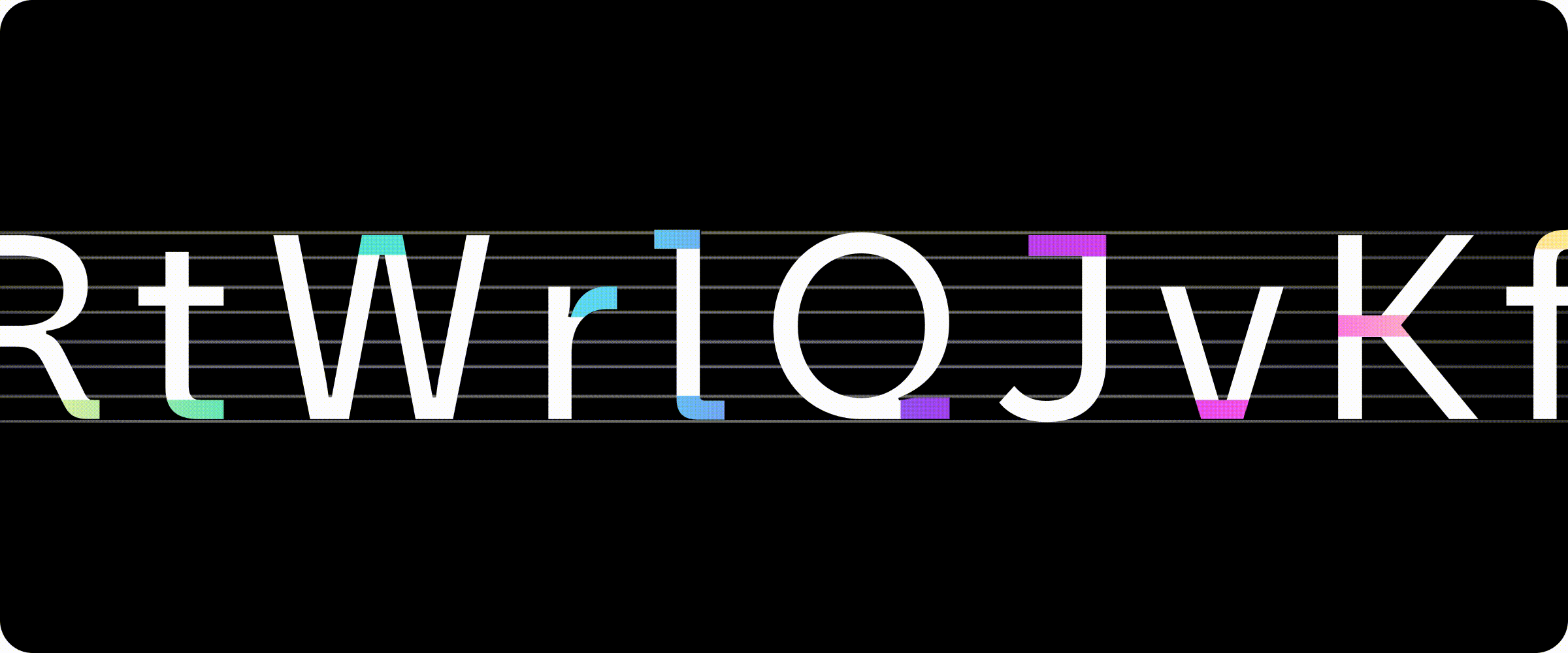
HashiCorp Sans features accentuated bridges and slabs at the top, middle, and bottom of some letterforms. This characteristic, woven throughout numerous letterforms, creates a horizontal flow through the typeface and exemplifies our foundational belief in workflows, not technologies. You can see this expressed at the top of the ‘W’ and the bottom of the ‘V’. The middle bridges in particular, like the one on the ‘K’, are directly inspired by the bridge in the HashiCorp logo.
»Developer-inspired
HashiCorp Sans also pulls in some developer-inspired characteristics — mainly from monospace fonts. While this is common among software brands, we paid extra attention to the slabs at the top and bottom of the ‘i’ and ’l’. XYZ built these letterforms to turn on and off depending on what flows best through each letter pair. This developer-inspired detail can be seen anchoring the middle of "HashiCorp," helping us to integrate the interCaps formatting in our name.
»Sparkle
What we call “sparkle” was an early epiphany in our design process, and the term stuck with us from beginning to end. The technical term for the cuts into the letters you see above is “ink traps.” They create a thick-and-thin contrast in the letterforms, which introduces a sense of movement. The ink traps also catch the eye — like a glint of light — as you read from left to right. We think about illumination a lot in the Brand Studio as we light the path for our customers' journey into The Infrastructure Cloud. We work hard to express that sense of light throughout HashiCorp’s visual language.
»Humanist
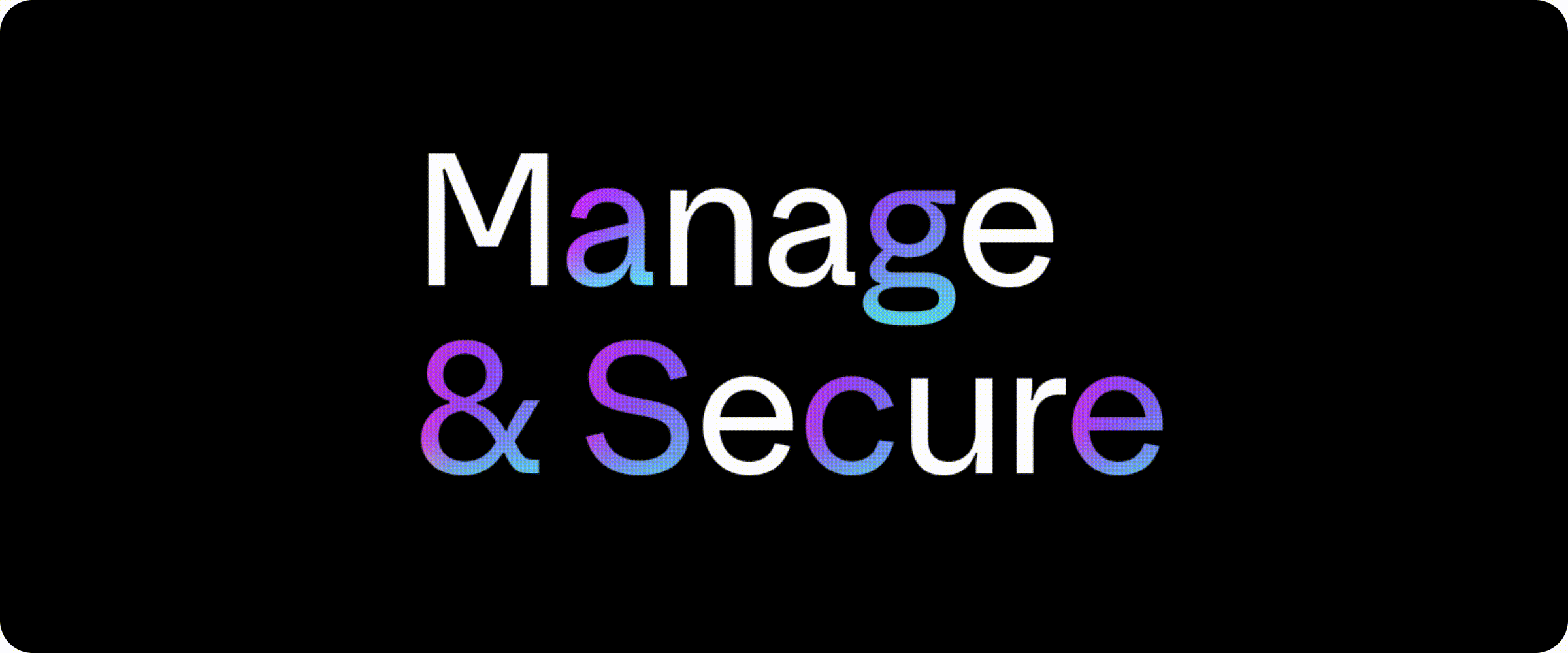
While HashiCorp is in the business of developing software, our products are designed to empower humans, so we wanted to retain an organic quality in our typeface. Humanist letterforms reference the human hand and sometimes the stroke of the pen. This trait is also present in our former corporate font, Klavika, which also blends geometric and humanist attributes. With HashiCorp Sans, you can see the calligraphic structure in double-story letterforms like the ‘a’, ‘g’, and ‘&’. And you can also feel it in the angles of the ‘S’, ‘c’, and ‘e’, which end on natural angles rather than being sliced at 90 degrees. Not surprisingly, we explored and debated this detail extensively before getting it just the way we wanted it.
»Pragmatic beauty
We rolled out HashiCorp Sans on April 22nd at our brand launch at Nasdaq HQ. It’s not surprising that our Brand Studio holds dear HashiCorp's principle of “beauty works better,” but we also believe in another HashiCorp principle: “pragmatism.” This much change doesn’t happen overnight. Over the next few months, we look forward to sharing more of HashiCorp Sans out in the world.