For any designer, feedback is critical to improving our work and our practice. By hearing others’ reactions, questions, and comments on our work, we gain new perspectives and ways to improve. The art of asking the right questions is a skill of its own. When done right, feedback helps us not just add visual polish, but answer lingering questions and make difficult choices.
Plus, we are a remote company. This means that we’ve had to make unique adjustments, and build a feedback approach that works around the fact that we can’t all get together in one room. Distributed collaboration requires rethinking the process, and relies upon us being prepared, present, and aware that someone can’t just look over our shoulder at the thing we’re making.
At HashiCorp, we’ve built feedback into the Product Design team by way of critique sessions. We all meet twice a week and present what we’re working on. The other designers watch the presentation, ask questions, and offer feedback and ideas we may not have considered. The goals of the session are: to make sure the design meets its objective; to remove blockers; empower each other; hear new perspectives; and build domain expertise. We each have a role in critique, and whether we’re the presenter or the audience, there’s always something to be learned from the process.
What follows here is a run-down of our critique process, as well as some takeaways from the first year of design critiques at HashiCorp.
Guidelines
We’ve been running these critiques for about a year now, but it is still being tinkered with as our team grows and our needs evolve. Here are a few of the things we’ve learned so far.
- Timebox! This is really important to stop discussions veering off into irrelevant, overly-detailed directions. It’s also a great way of making sure that we set initial context in a way that isn’t overly complicated.
- Scope: We try to bring a problem to critique that is manageably presented, understood, and discussed in a twenty-minute (per person) time frame. If it’s a bigger project, we sometimes split it up across sessions and smaller increments.
- Keep it abstract! When presenting a problem, we often don’t need to go into the exact details of the product we’re working on in order to explain it. Most often, an abstraction such as: “I’m trying to present an expandable list, but I’m constrained by an unwieldy piece of data.”
- Have a facilitator: Allow the presenter to focus on presenting and the audience on giving feedback. A facilitator keeps everyone on track and isn’t afraid to say: “We need to wrap up now.”
- Ask exploratory questions: When feedback is written in an open, curious way that allows the designer to explore their answer rather than feel like they’re defending their work, it facilitates collaboration rather than justification.
- Reinforce: Let people know what they’ve done well; this ensures that it stays in the design.
- Prep and presence is key: Before presenting, it’s critical to know what we want from the session. If we don’t take the time to prepare, it isn’t nearly as successful. Before giving feedback, we must make an effort to be present and listen to the context that the presenter provides.
- Run critique regularly: Right now, we hold critique twice a week. We don’t always have people sign up for both sessions, but even the weekly regularity is great for maintaining context for larger projects.
How it Works
The single biggest problem in communication is the illusion that it has taken place.
– George Bernard Shaw
We have two 90-minute blocks for critiques each week. We may or may not use them, but calendar holds ensure that we have the time by default, and don’t need to shoehorn it into anyone’s schedule. This is especially important in a remote setting, where it’s easy to get caught heads-down and skip a meeting where we think it’s unnecessary; a standing meeting makes it more likely we’ll show up and share. It does get cancelled on light weeks, of course, but we make that decision as a group.
Setup & Preparation
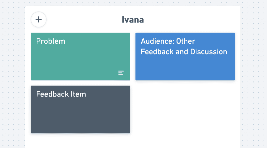
Each critique takes place as a Zoom meeting using Whimsical as the platform. In Whimsical, each week has its own board, containing presentation materials and a sign-up for both Tuesday and Thursday. To make sure the meeting runs well, preparation is key. To enable that, we each get a Whimsical template that looks like this:
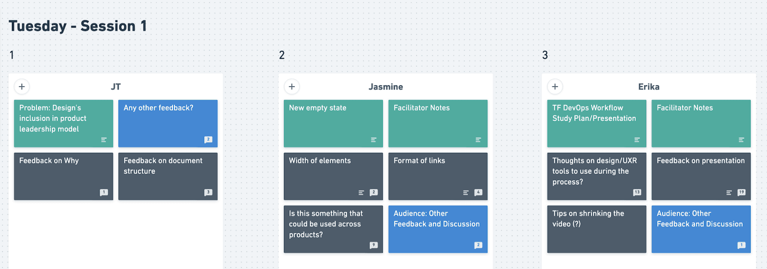
We sign up to present during critique by taking our card and dragging it into the timeslot for our chosen day, like this:
Keep in mind that we do not sign up to give feedback — by being present in the meeting, we commit to giving it.That template needs to be filled in with the name of the task, the problem we’re trying to solve, any relevant/linked visuals or materials, and the specific aspects of the work we’re looking to address. Here’s an example:
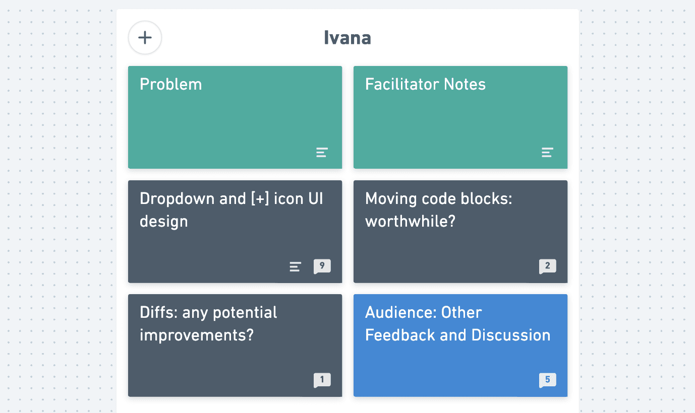
The green cards are for stating the problem. The dark grey cards are the specific areas of focus for feedback. The bright blue card is a space for further comments that occur to the audience. It’s also very important to set constraints: what we don’t want feedback on is often just as important.
Why does this all matter? Because when all we have is screen-sharing, it’s easy for context to be missed and important feedback to be lost. This sort of preparation ensures that everyone always has the important information to hand, at all times.
Setting the Scene
When presentation time arrives, the designer takes 5–10 minutes to describe the problem being solved. Because we work on different HashiCorp products — each of them deeply technical and complex in their own right — we do not always have the necessary context. Here’s an example from a Problem card written by Jasmine:
While designing the visualization for L7 routing, we decided to explore a new empty state template with the intent of enticing users to configure their traffic routing. We want to include an example of what the user would see once they’ve set it up, and give them options to learn more and copy a starter code snippet.
Looking for feedback on:
- How is the width of the sample image, description, and other elements?
- How is the placement/format of links?
- Is this something that can be used across our products?
During this presentation, it’s tempting to go into minute details of the problem. However, it’s often the case that abstracting away a lot of the product-specific details and focusing on the UX or design goal (“We need to present a detailed list, with this particular constraint…”) and its priorities is more successful than a detailed deep-dive.
After the problem is clear, we follow by screen-sharing and presenting the design solution so far. Things that are important here include:
- What stage of work is this in (early, mid, late)?
- What were the relevant priorities or constraints?
- What foundational documentation would be helpful? If there is information architecture, wireframes, a visualization, or user stories that would be useful, present them also!
The audience can also ask questions. What’s critical is that they have enough context and understanding of the design goal in order to be able to help. Again, in a distributed setting, sharing one’s screen and talking through it (while also having the other information available in the background) means that the audience can watch the presentation while also having other pertinent information open, and flip back between them to gain a fuller understanding.
Giving Feedback
Once the designer has finished presenting, it’s time for the audience to give their thoughts. They do this by commenting on the individual cards. The goals are to share what we like and offer feedback in a way that moves the solution forward. This usually means framing the feedback in the form of an exploratory, guiding question. We time-box this to a few minutes.
As an example, for these three cards:
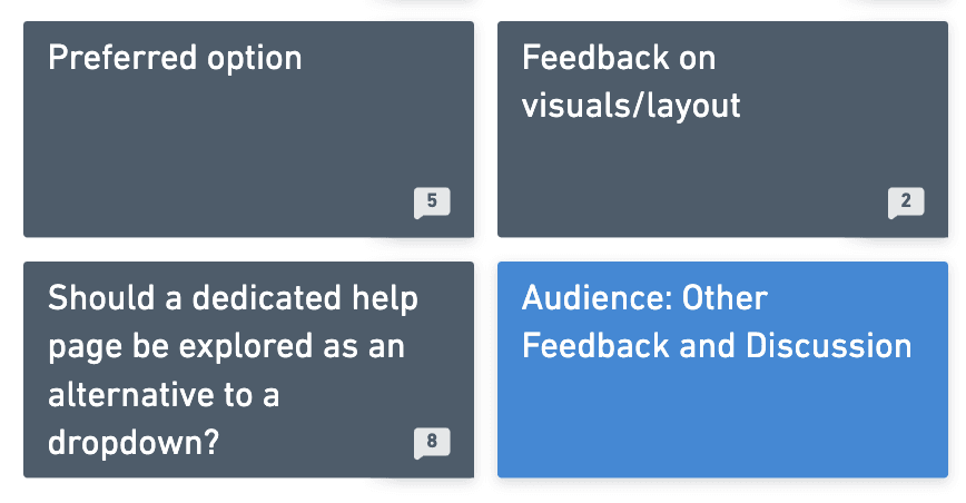
The designer is specifically looking for feedback on “Preferred option” and “Feedback on visuals/layout” and “Should a dedicated help page be explored.” There is an “Other Feedback” option as well. Our comments within that might look something like this:
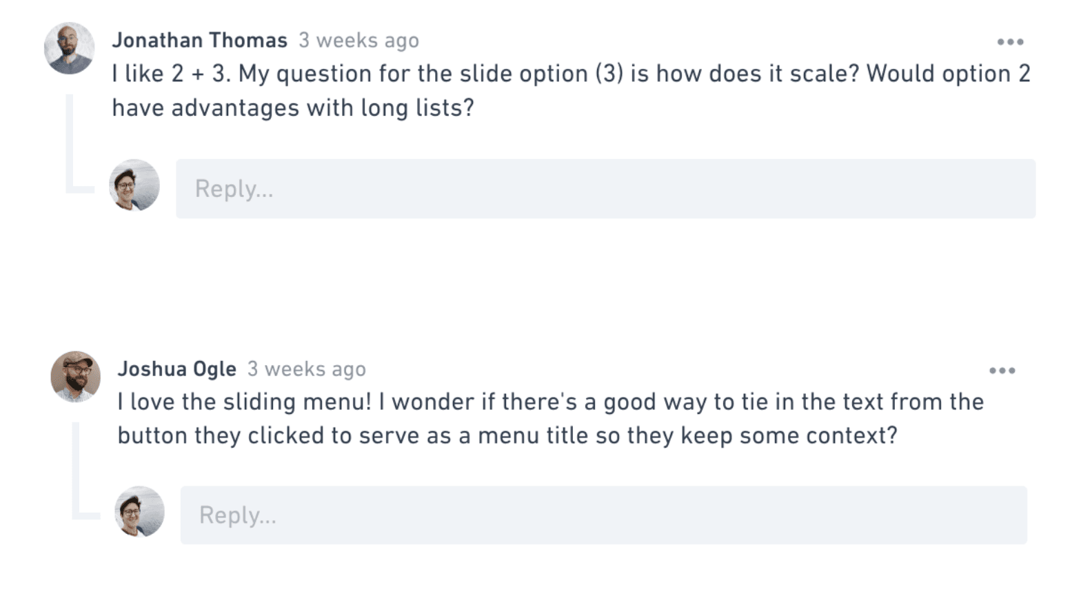
The act of writing out feedback instead of discussing it was an intentional choice. This means that everyone has a voice, instead of favoring those more inclined to speak out. Further, one of the greatest challenges of distributed collaboration is keeping a record of things; this method ensures that we always have the feedback to hand, long after the session is over.
The reins are then handed back to the designer, who addresses each piece of feedback in turn (and in a timely fashion). Sometimes this is as simple as “No, I hadn’t considered that option, I’ll try that in the next iteration, thanks!” The goal isn’t to have lengthy discussions; it’s to give the designer ways to move forward on the problem.
Bonus! Extend This Framework to Other Meetings
Have you ever shown your early designs and then conversation goes off course to focus on details that don’t need feedback at this stage? We’ve all been there.
There’s always a risk when showing designs to larger groups, especially engineers, and PMs. Feedback can become unfocused even if you state it at the beginning and reigning it in can be a task of its own.
This framework keeps the feedback you want top of mind and focuses discussion around what matters most. You save time by removing sequential discussions and avoiding a meeting where the loudest person wins. Better still, the quiet ones can voice their opinions equally and everyone feels heard.
When scoping a design critique for your product team, try using one board for gathering feedback on designs and another board for switching to implementation and technical details.
That’s It!
It takes a great deal of thought to tackle distributed collaboration, giving and receiving feedback, and keeping a record of that work and feedback in a remote setting. Re-thinking this process based on our experience and our goals, and being willing to make changes to that process along the way has been invaluable to us. If you’d like to see an example board in Whimsical, we’ve created one here.
We continue to take away new things as our design team adds new folks and more work. For now, Whimsical keeps track of all of our previous critiques, a record of all of the communication that (cheers, George Bernard Shaw), has taken place and the feedback that’s been offered. We look forward to improving the process, both of facilitating feedback and writing it out for each other.


